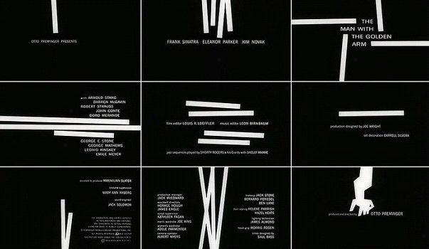
When a few white lines drawn on a black background finally converged into a shape of an arm, the history of film title design was about to change. But what happened before that? What marked the history of film title design and who were its pioneers?

The silent era of film title design
The year when the abovementioned title design appeared was 1955, and the film it opened was Otto Preminger's The Man with the Golden Arm. The film tells a story about a musician who fights his heroin addiction.
The theme was aptly introduced with the moving white lines and an arm, providing as much clue about the following story as any summary.
This level of aesthetic sophistication was technically possible in the mid-1950s, but the beginnings of title design history were quite different. Like any other element of cinematography, film titles also followed technical possibilities of the times and were often limited by them as well.
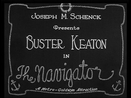
In the era of silent movies, film titles were static images that announced the title of the film and a few main protagonists. They were made by the lettering artists with the assistance of typesetters. Once done, they were photographed and then edited into a film.
Letters were painted in simple forms at the beginning but later became more decorative and expressive under the influence of art movements such as Art Nouveau and Expressionism.
The style of letterforms and intertitles, which were used as additional explainers during the film, reflected sometimes the tone or the subject matter of a film.

Film title for The Navigator, 1924. Image via Pinterest.
The first talkies and the golden age of Hollywood
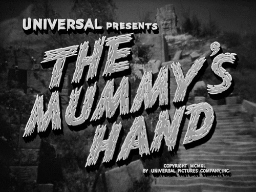
The appearance of the first movies with sound did not have immediate effect on the history of film title design. Film titles remained static, but the style evolved to include more elaborate designs. Graphic novelties incorporated further adjustments to the theme of the films, such as adding flowers for romances or black letterings for horrors. The illusion of depth was achieved with drop shadows; letters were sometimes done in two tones, and images related to the film were included to add drama.
Music also gained more prominence, and the designers in the likes of Oskar Fischinger started to subordinate visual rhythms to the title soundtrack. Fischinger’s concept of score visualization was later adopted by the title legends such as Saul Bass.

Film title for The Mummy’s Hand, 1940. Image via annyas.com
The rebirth of the history of film title design
The period starting with the 1960s saw the growing interest in title design. Big studios were losing the battle with the TV and needed fresh ideas that will bring audiences back to the movie theaters. Much attention was given to big, historical stories, but other film segments also came under scrutiny.
With studios ready to invest more money in every part of a film, title design also became a point of interest. Soon the new generation of designers emerged, recognized by directors such as Alfred Hitchcock, Otto Preminger, and Stanley Donen.
Maurice Binder, Richard Williams, Saul Bass and Pablo Ferro are among the most prominent names of title design that came to be regarded as stars in their own terms. The emergence of title sequences, in contrast to static titles that characterized the previous period, happened thanks to them.
Apart from dynamism and movement that motion graphic titles already possess, these artists included other engaging visual aspects in their work as well. The combination of photography and illustrations with motion graphics was common, and logo-type titles were used in the advertising of films as well.
You can see some of the legendary title designs in this video.
The digital era and modern tendencies
With the possibilities of digital imagery, the history of film title design took a significant twist. What characterizes it from the 1980s onward is the free application of different layers of images, styles, and textures within one sequence, and an even stronger focus on narrative.
The illusion of space, manipulated typography, and physically impossible movements characterize new title design, which is gaining more prominence in cinema.
Over the years, title sequences introduced us to the main actors and persons who created the film. They have set the general atmosphere of a film and whetted our interest in the story that will be told. With technical innovations happening every day, we look forward to seeing in which direction will title design develop in the future!
Featured image: Film sequence for The Man with the Golden Arm, 1955, via canva.com.
Back to introbrand.com
